

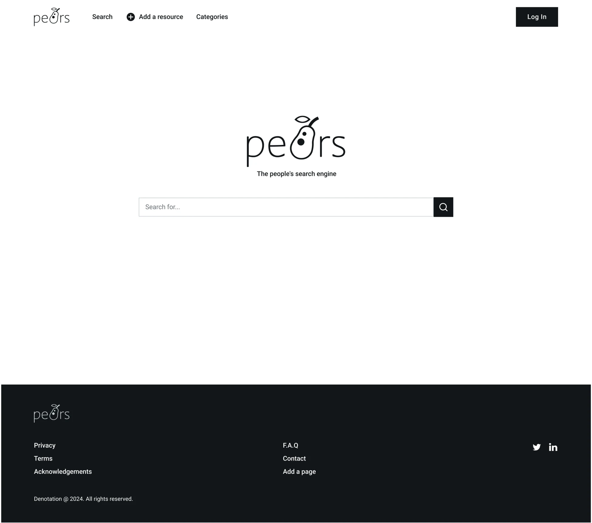
Making contributing to an open-source search engine faster & simpler
- Role
- UX consultant
Product designer - Team
- 1 designer
1 engineer - Skills
- Product, UX
- Timeline
- Jan–Mar 2024
Overview
PeARS is an open-source, privacy-focused search engine designed for researchers and non-profits. Because it relies on users manually submitting web pages to their search engine instances, the challenge was to remove usability barriers that made contributing difficult.
Impact
All of my design recommendations were shipped. They led to better accessibility — color contrast and touch target size issues were eliminated & night mode implemented. The time needed to submit an entry was reduced by more than half.
My Role
I worked as an independent UX consultant with the PeARS team over seven weeks, from January to March 2024. I conducted a competitive analysis, UX audit, and usability testing, then delivered wireframes and recommendations covering accessibility, navigation, terminology, and system feedback.
Key Design Decisions
Replacing technical terminology with familiar language
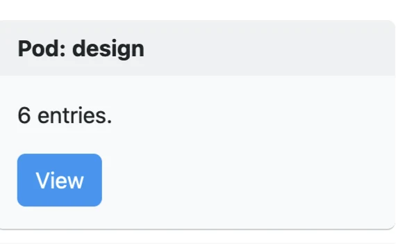
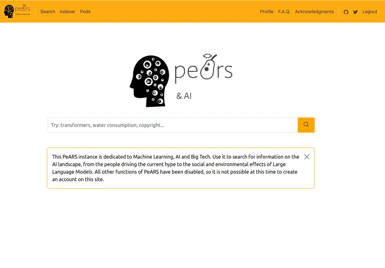
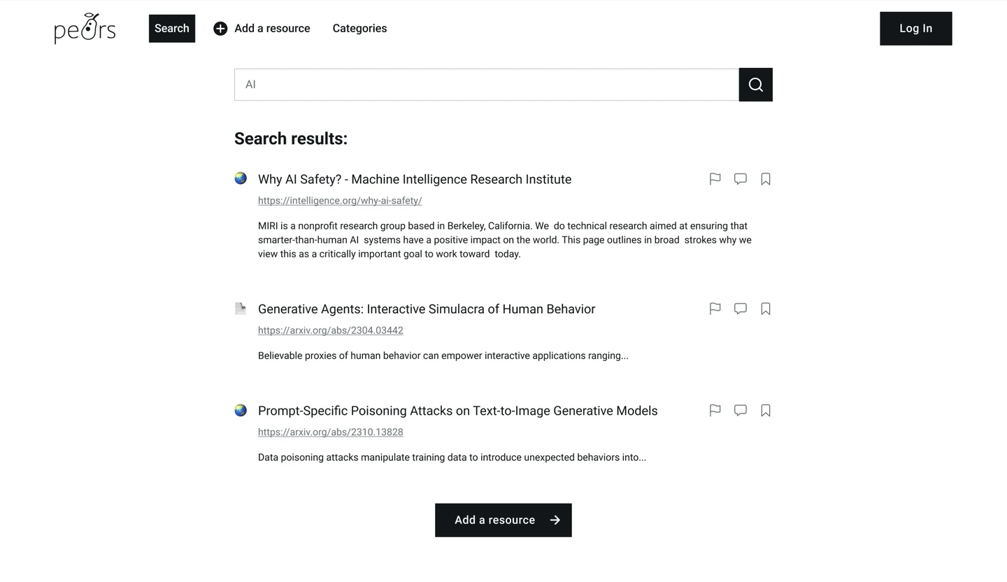
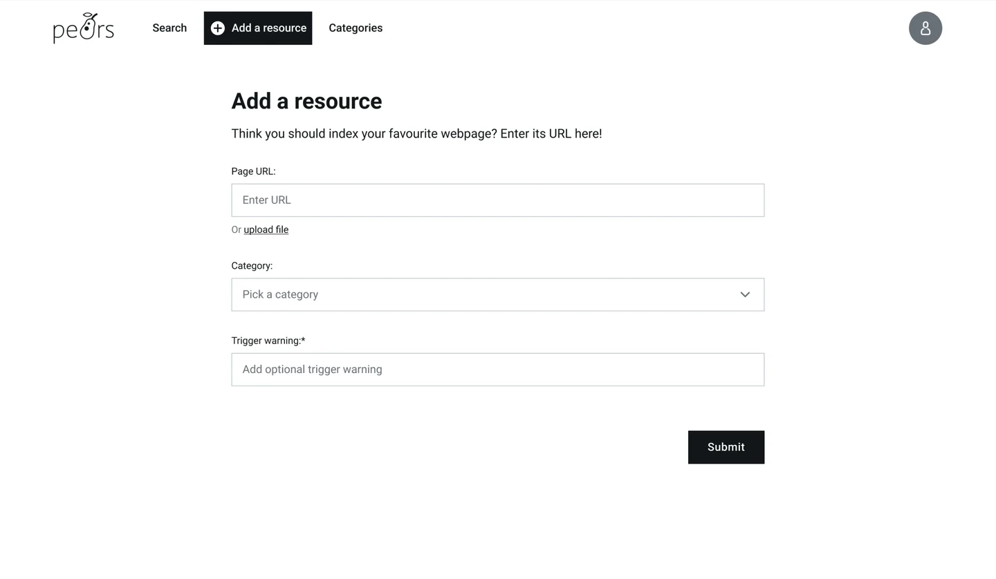
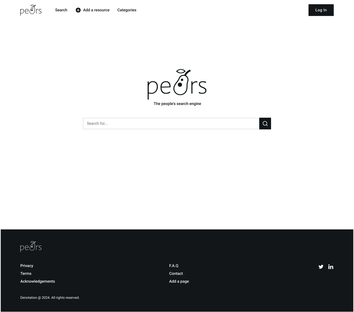
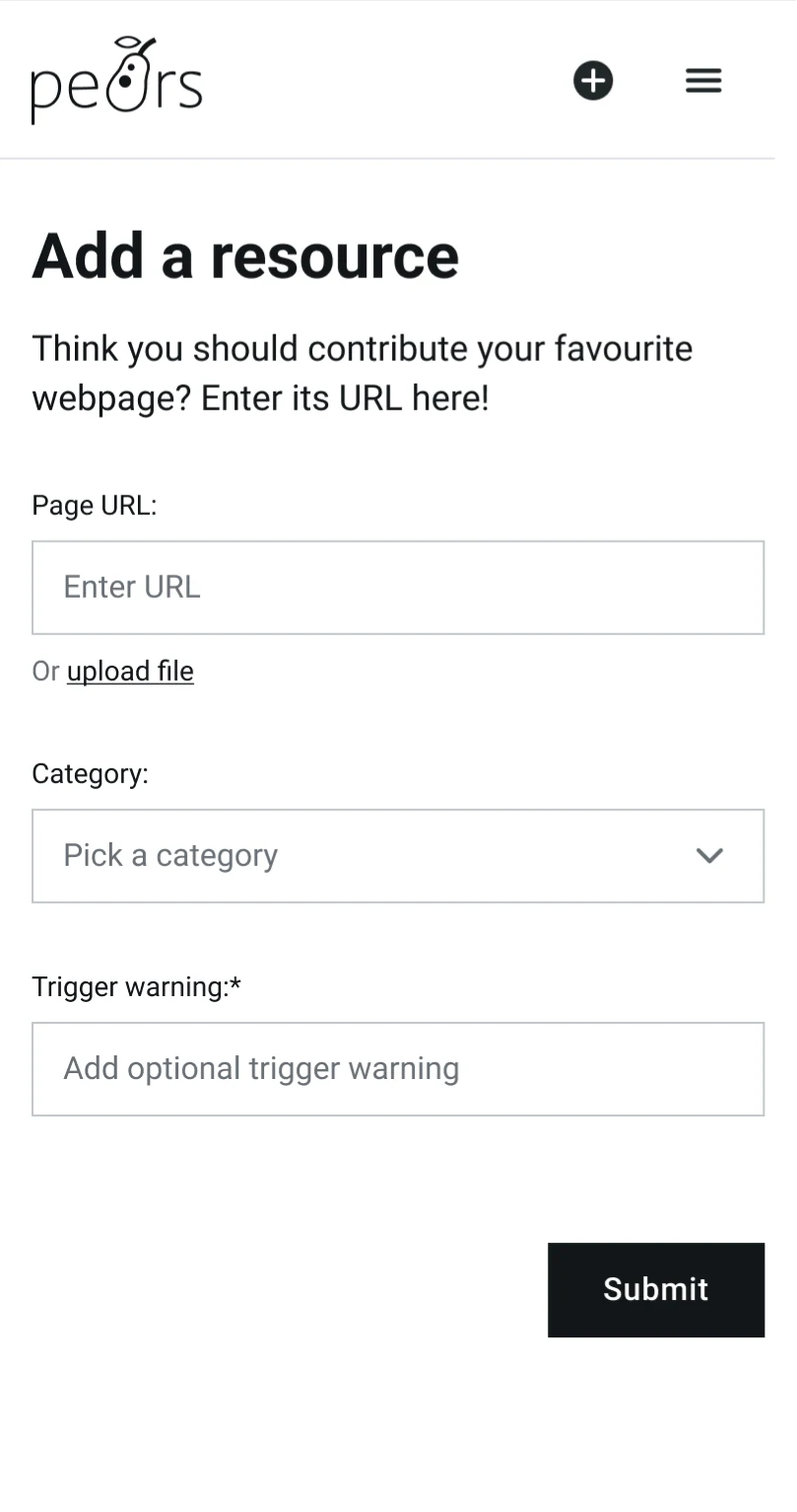
Terms such as “Indexer” and “Pods” were unfamiliar to the core user base of researchers, making it difficult to understand how to submit a website and choose a category. I recommended replacing system-oriented terminology with more familiar language to make these actions easier to understand — “suggest” and “categories”.

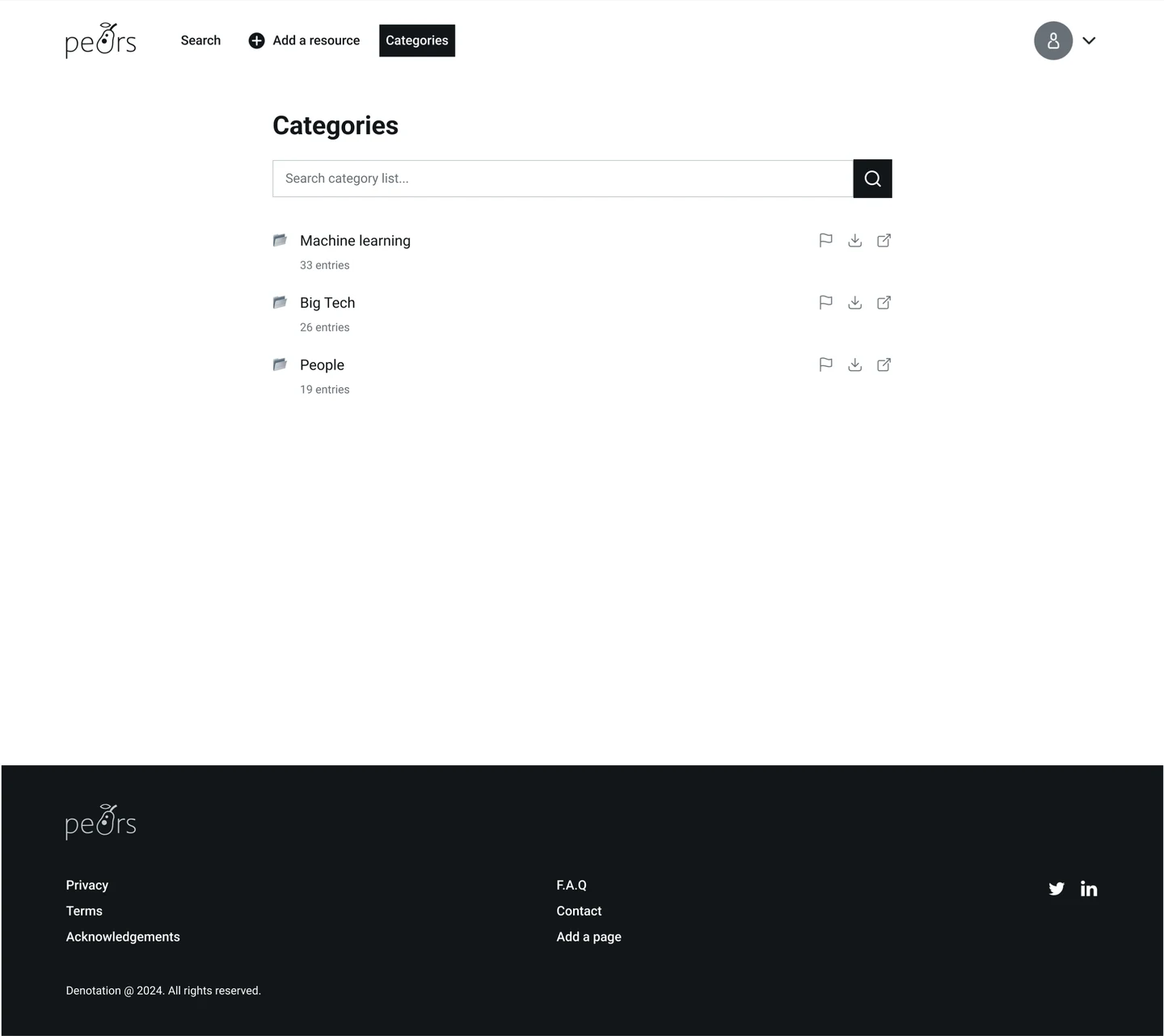
Making contribution actions clearer
Users needed clearer ways to contribute web pages to their search engine instances. I recommended more prominent calls to action to make submission options easier to identify. Example — if a query search yields no results, the page shows a “Contribute” button.
Improving consistency, accessibility, and system feedback
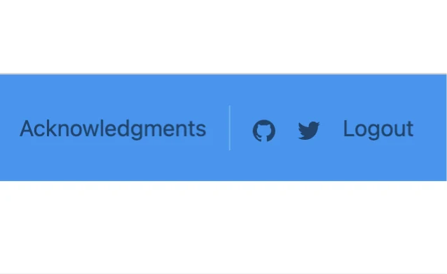
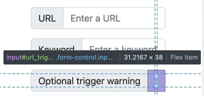
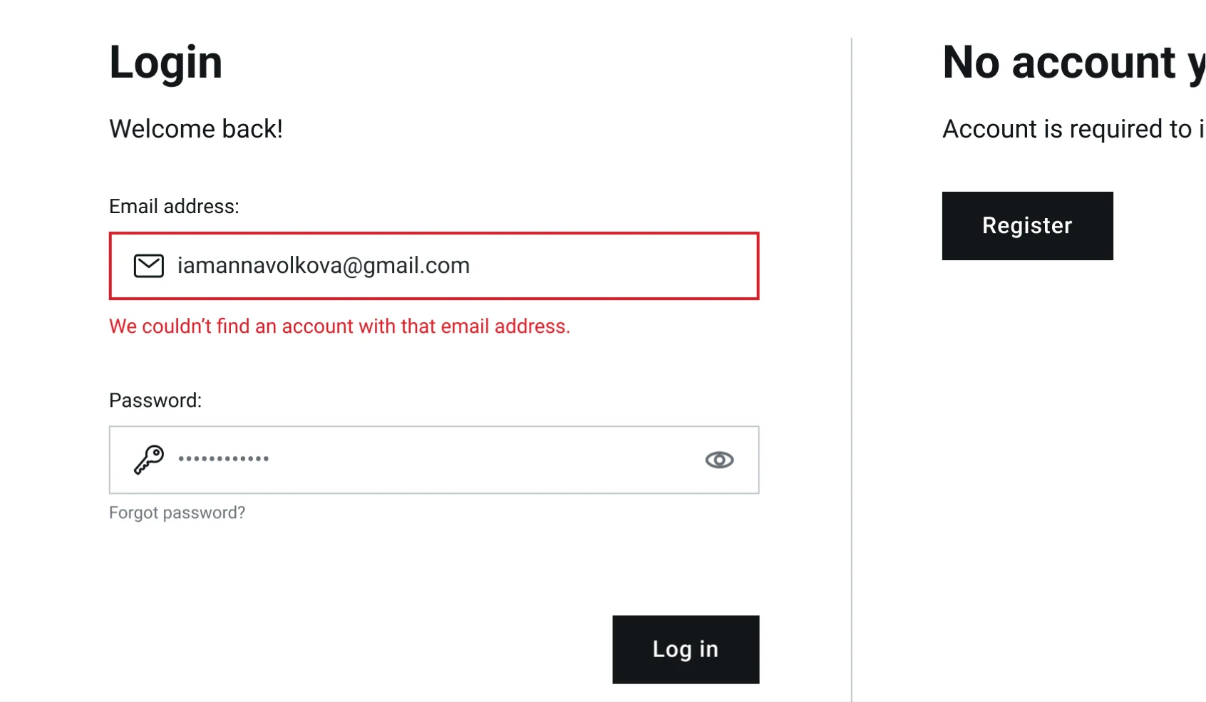
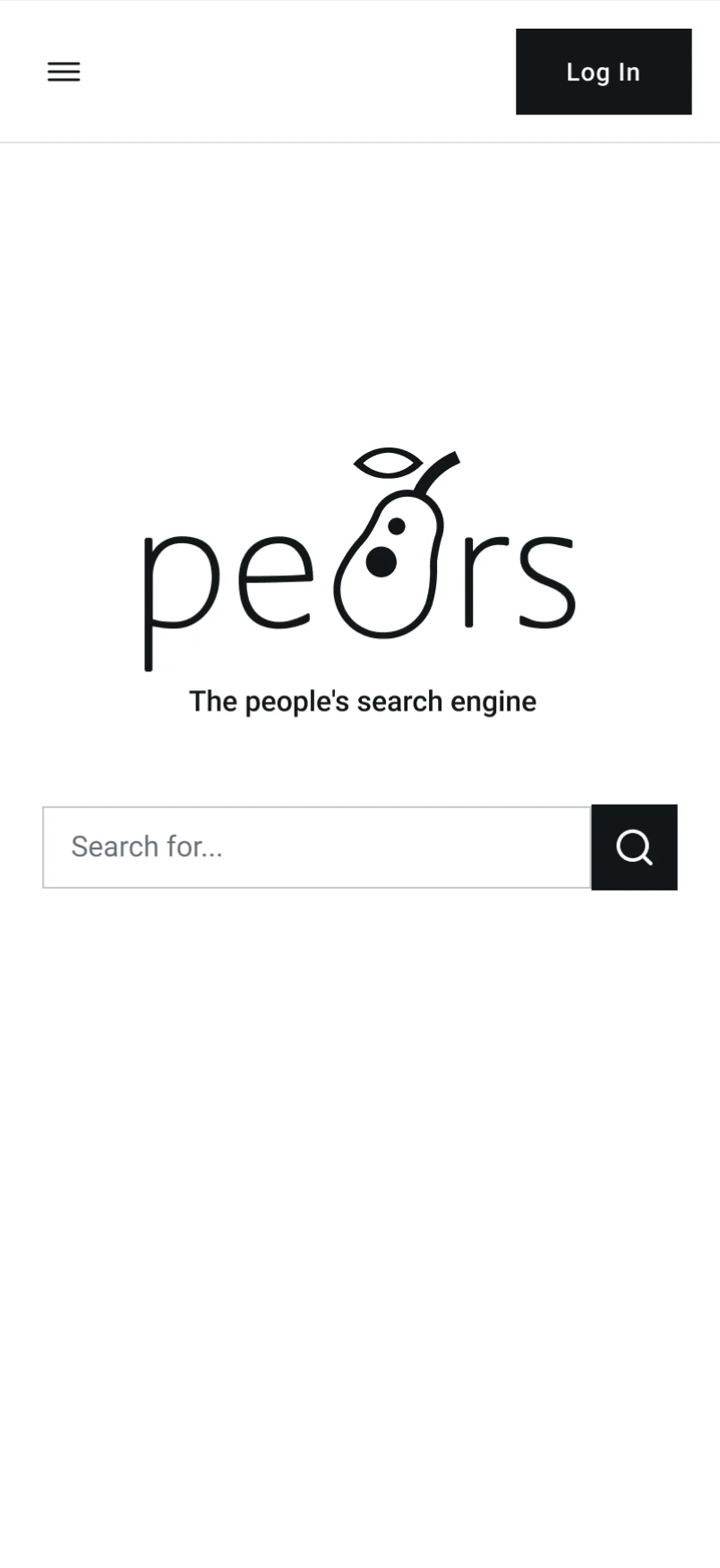
Usability testing revealed inconsistent navigation patterns between pages and a lack of feedback during errors, both of which led to confusion and decreased confidence. I recommended consistent navigation across pages, clearer error feedback, improved color contrast, larger touch targets, and a night mode.

Outcome
See more


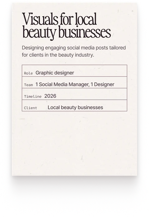
Visuals for local beauty businesses
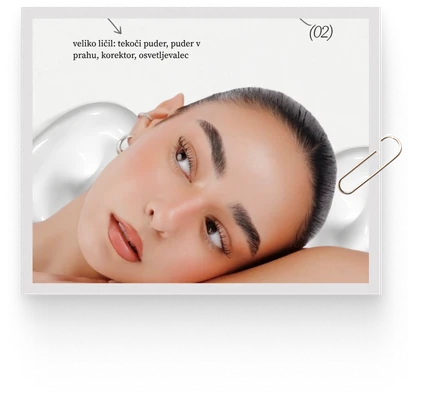
Designing engaging social media posts tailored for clients in the beauty industry.
- Role
- Graphic designer
- Team
- 1 Social Media Manager, 1 Designer
- Timeline
- 2026
- Client
- Local beauty businesses